BRAND CHALLENGE
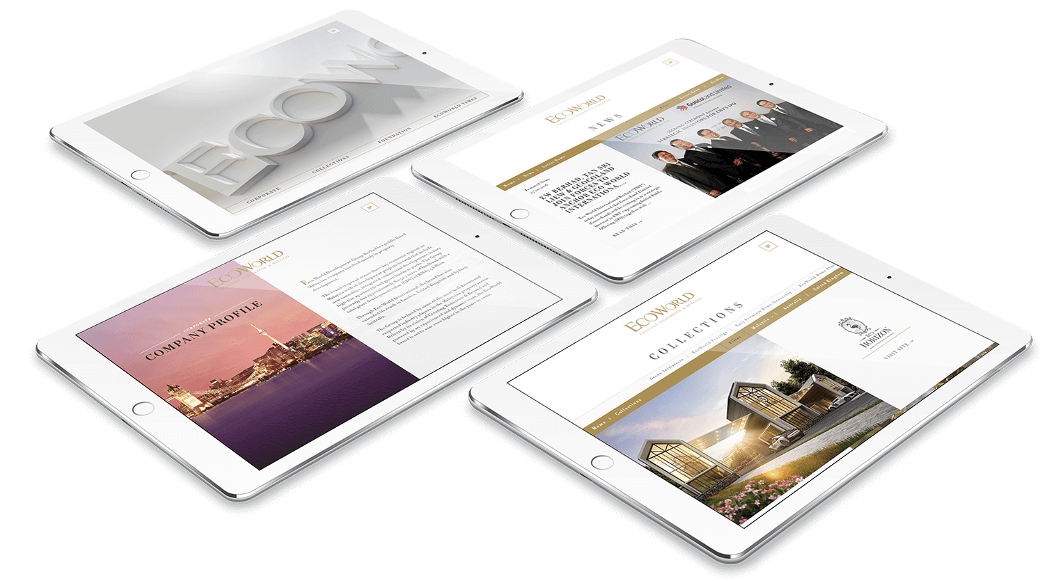
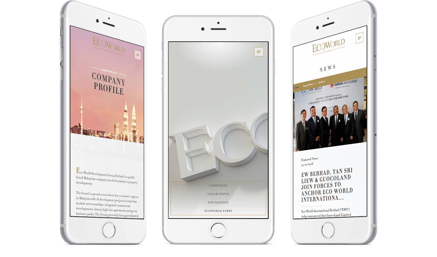
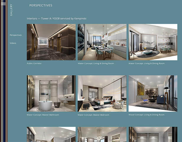
Revolving around the concept of interactivity, the design of the website was taken in a fun yet functional approach. Impressed with the former website that won various accolades, the client decided to step into the next level of brand grooming by revamping their website.
The brief required us to deliver a brand new website that swayed from the previous one, albeit similar to the contextual meaning of the award-winning website.
BRAND SOLUTION
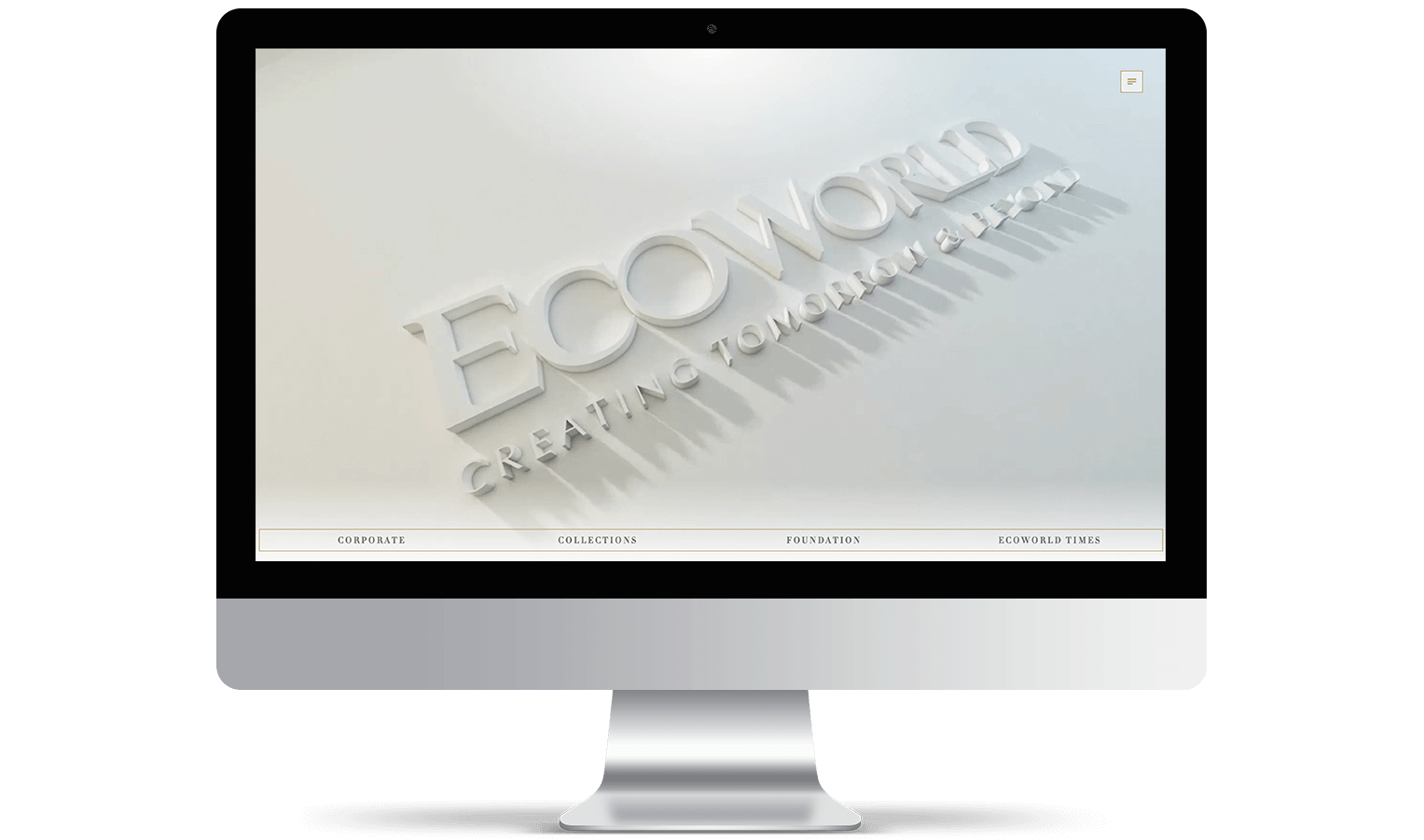
First and foremost, the look and feel concept was established — a clean, minimal and crisp design was proposed to the client’s penchant. Following the approved look and feel, syntax works were devised to begin building the website. Further strengthening this strategy is the quality assurance of the website’s efficient functionality given the animation input.
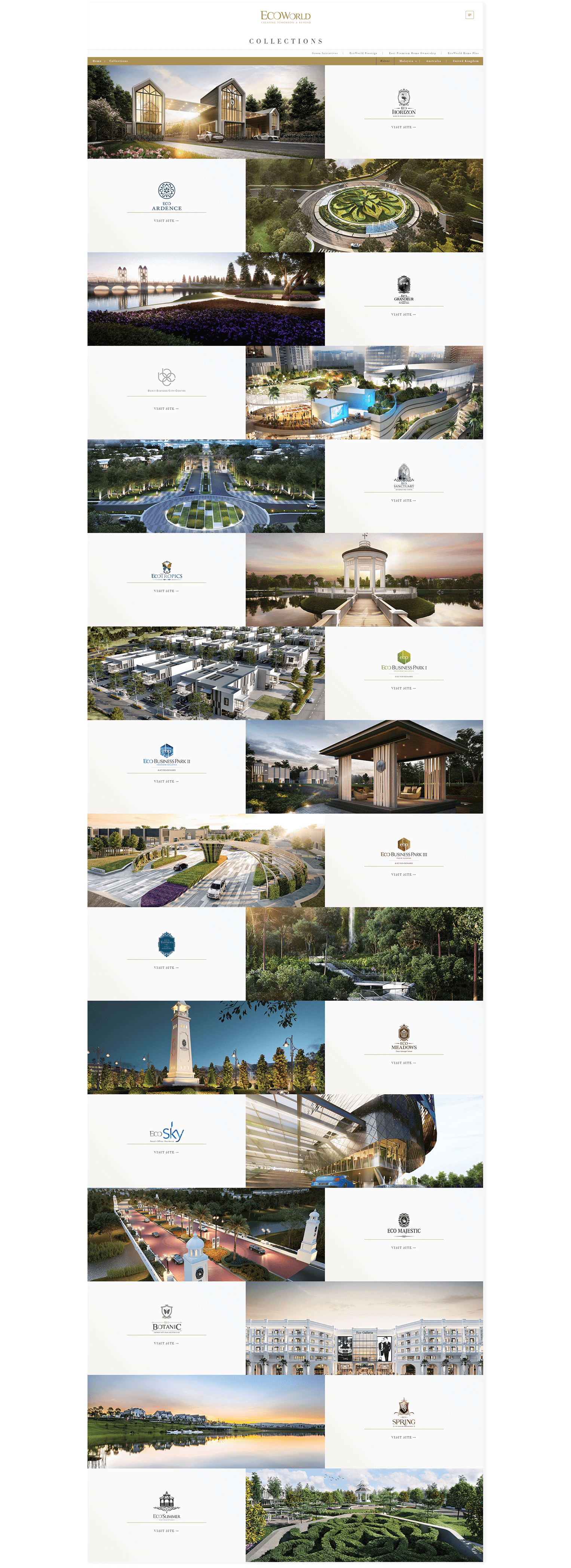
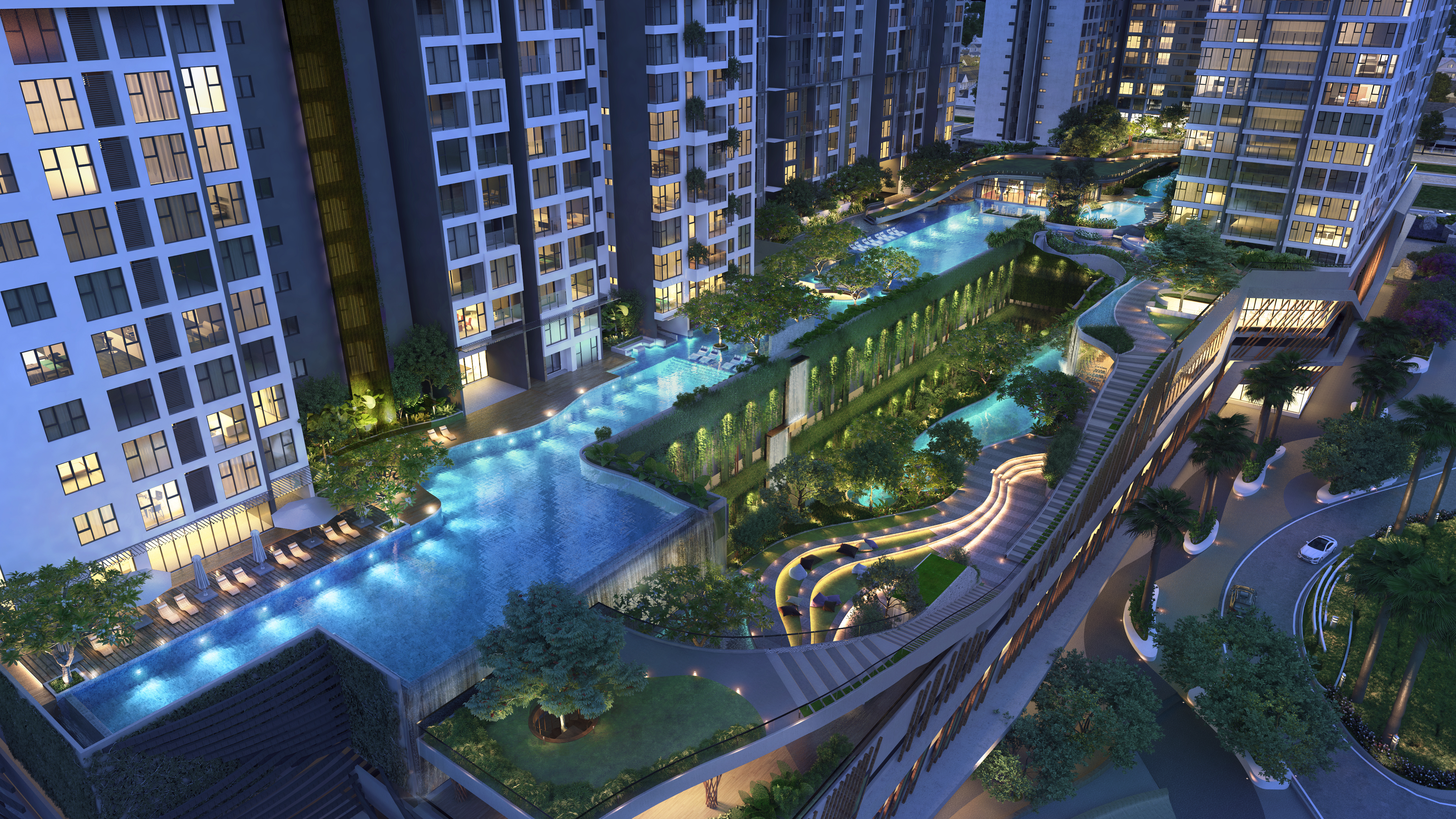
Our Visual team were also actively involved, working hand in hand with the UX and IT department to include the architectural 3D walkthroughs of each development. This gives online visitors an instant welcoming feel to the website – as well as an opportunity to virtually experience the grandeur of EcoWorld’s magnificent developments.

